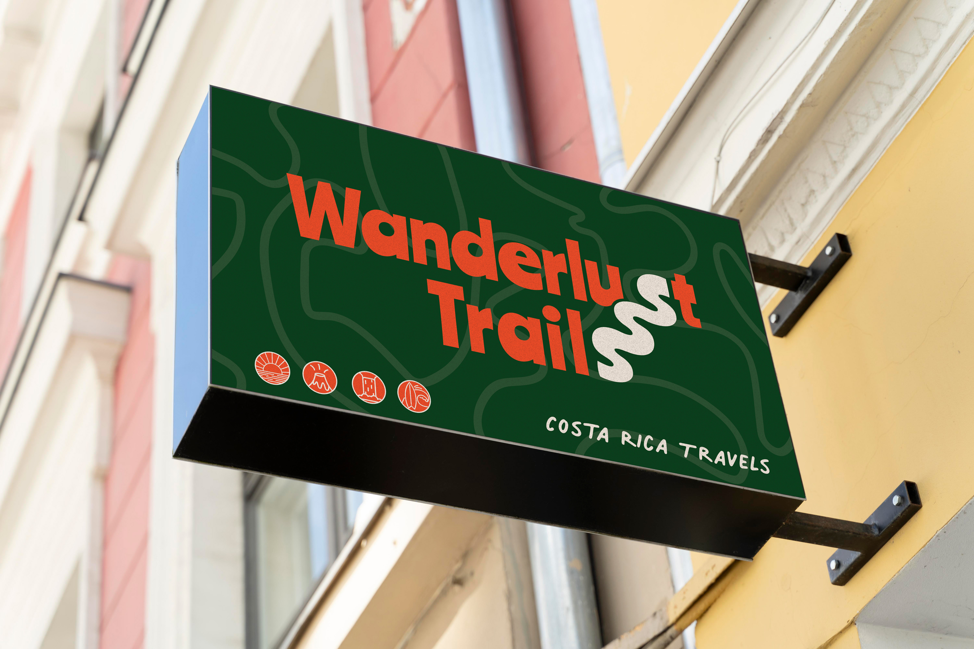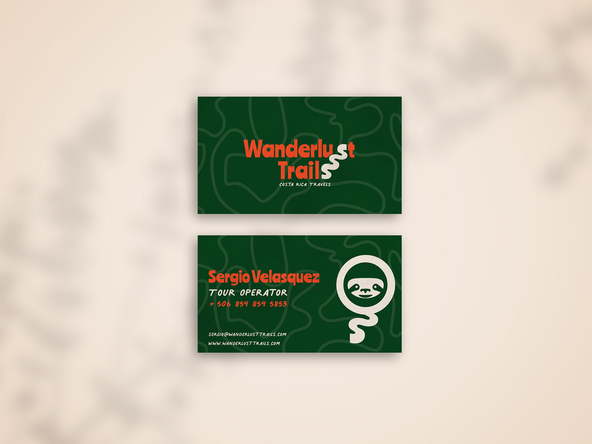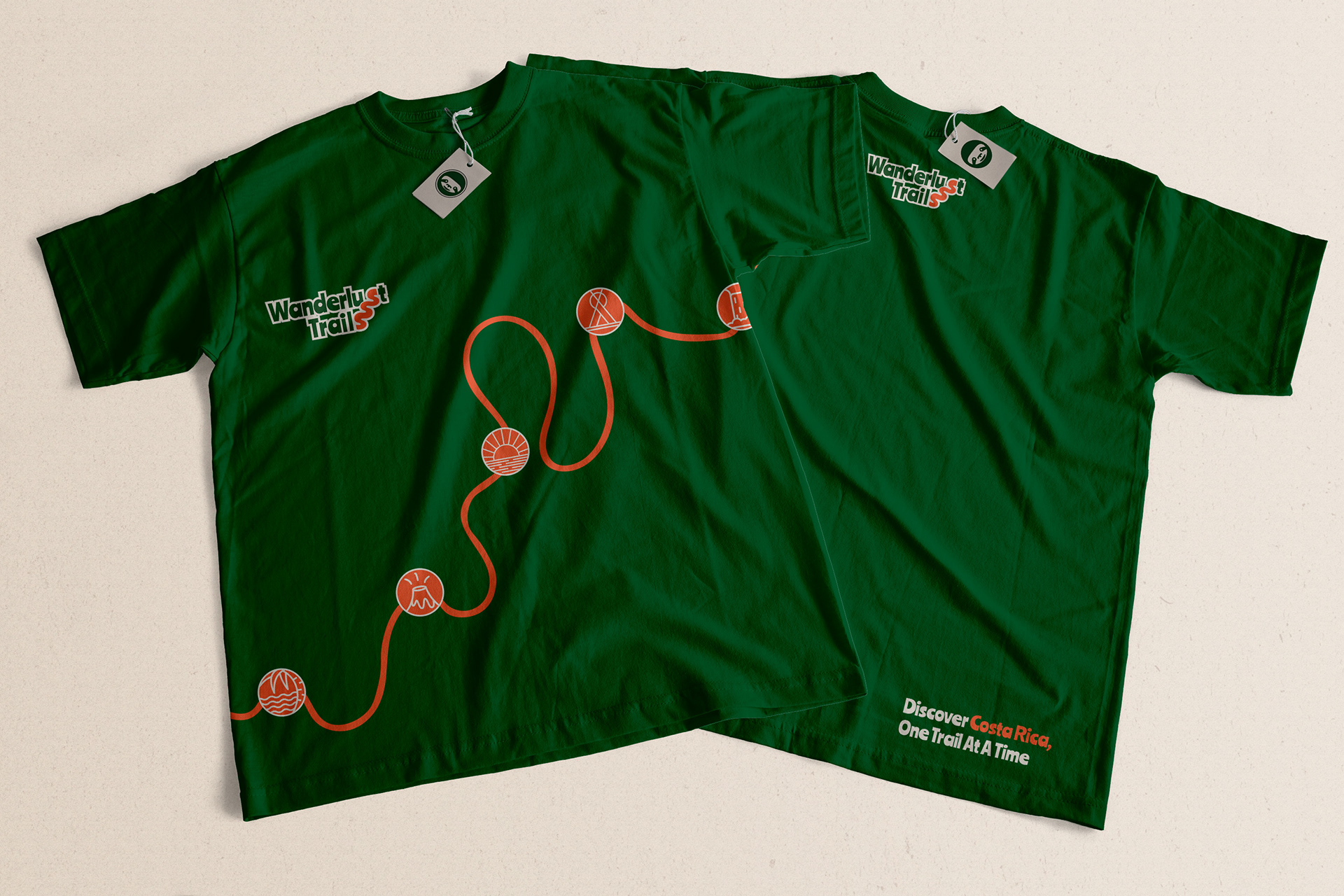
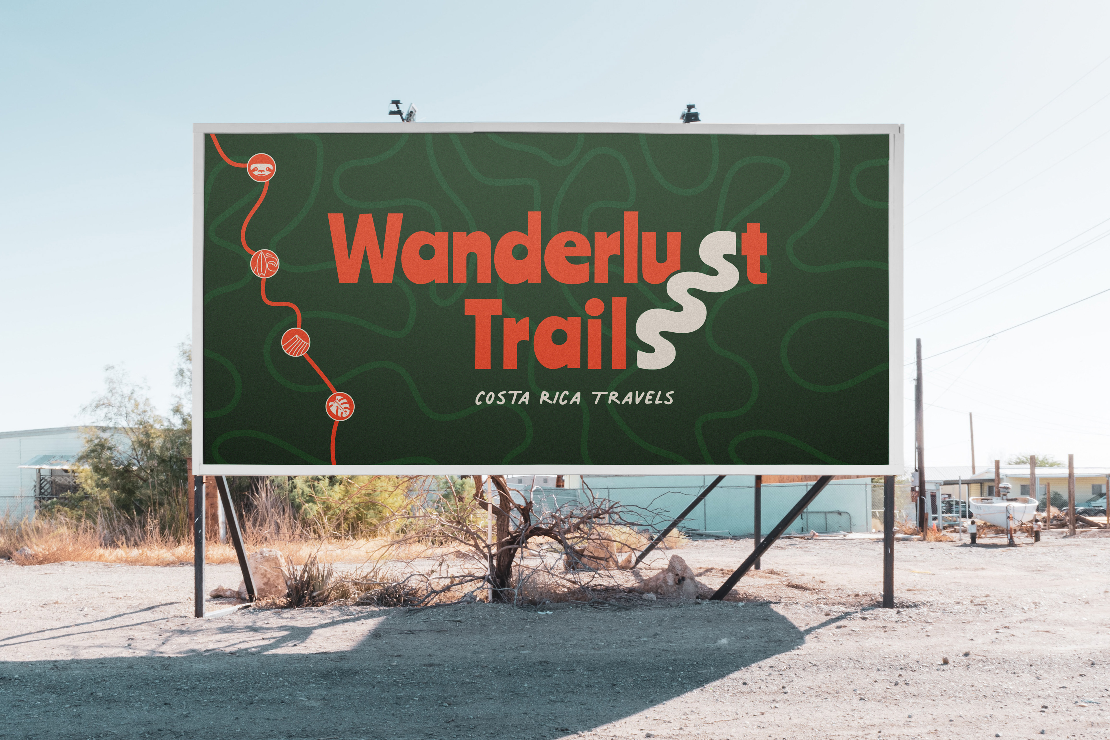
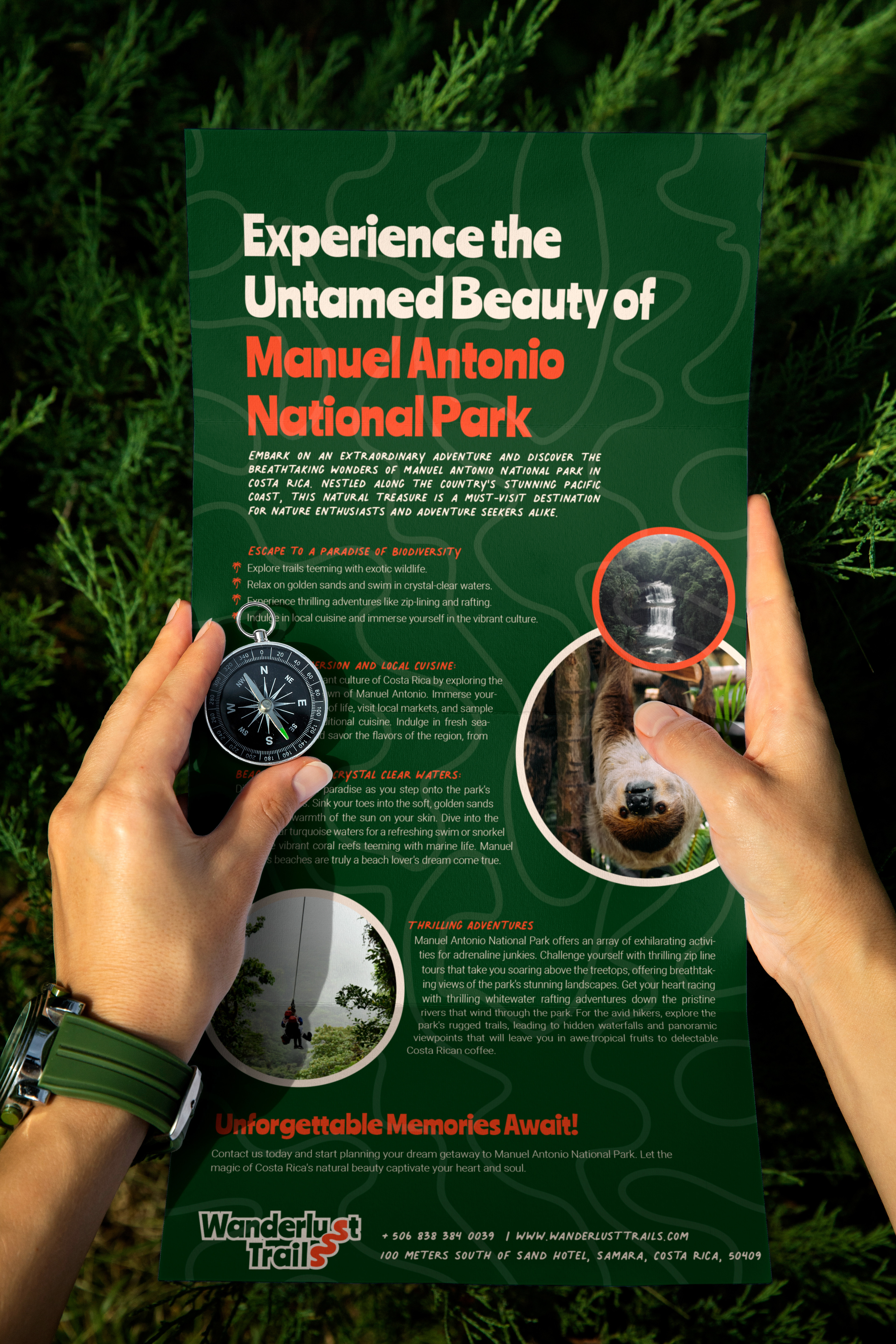
At the heart of the brand lies a captivating logo, featuring chunky and playful letters. The "S" in Wanderlust Trails cleverly connects with trails, forming a wavy line that symbolizes the meandering paths of exploration. This emblem captures the essence of adventure and serves as a memorable representation of the company's spirit.
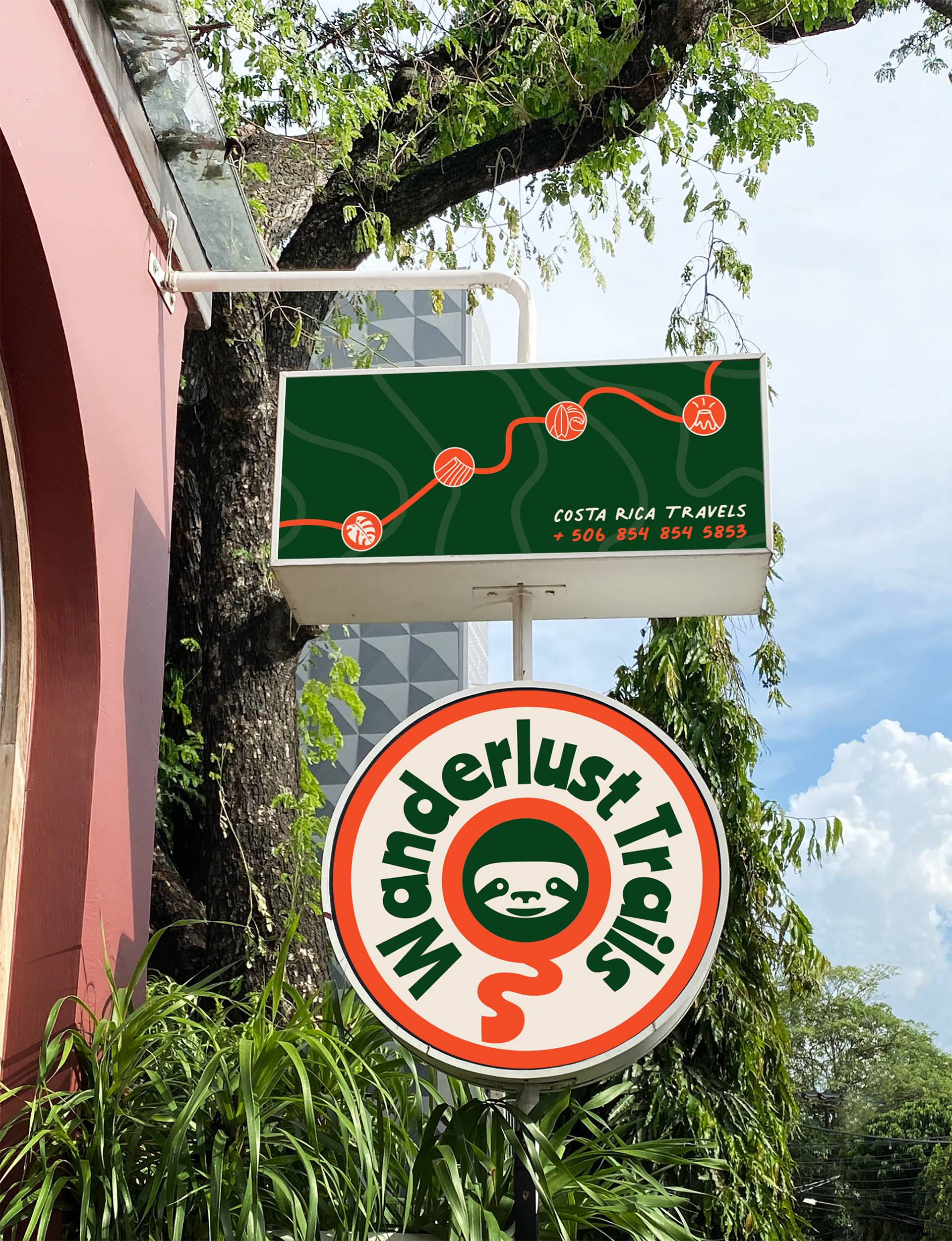
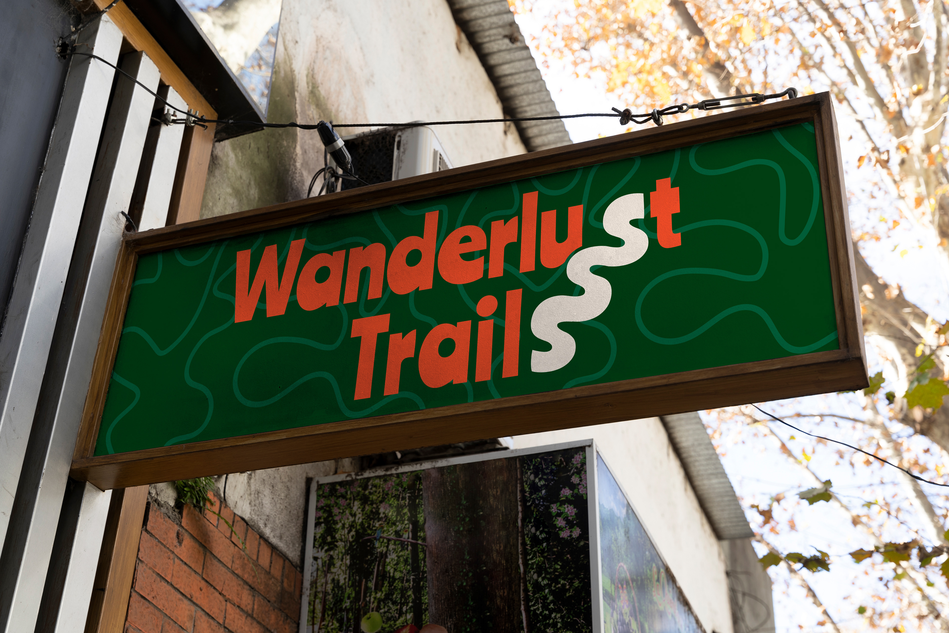


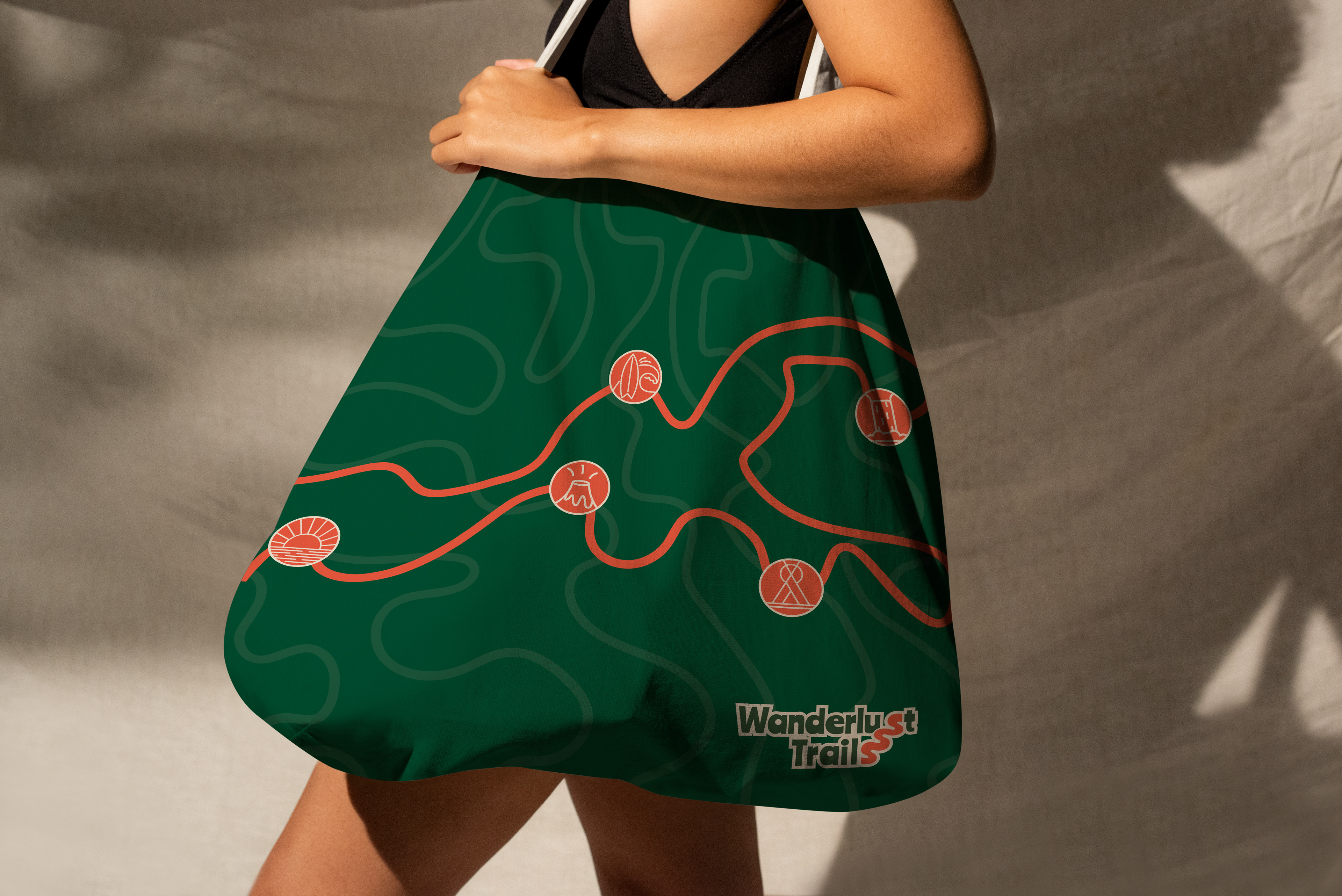
The color palette reflects the lush Costa Rican landscape. A deep, rich green (08401b) mirrors the vibrant and abundant nature found throughout the country. To add a touch of contrast and energy, a vibrant orange shade (f24c27) is employed, reminiscent of the captivating sunsets and blooming flowers that grace Costa Rica's horizons.
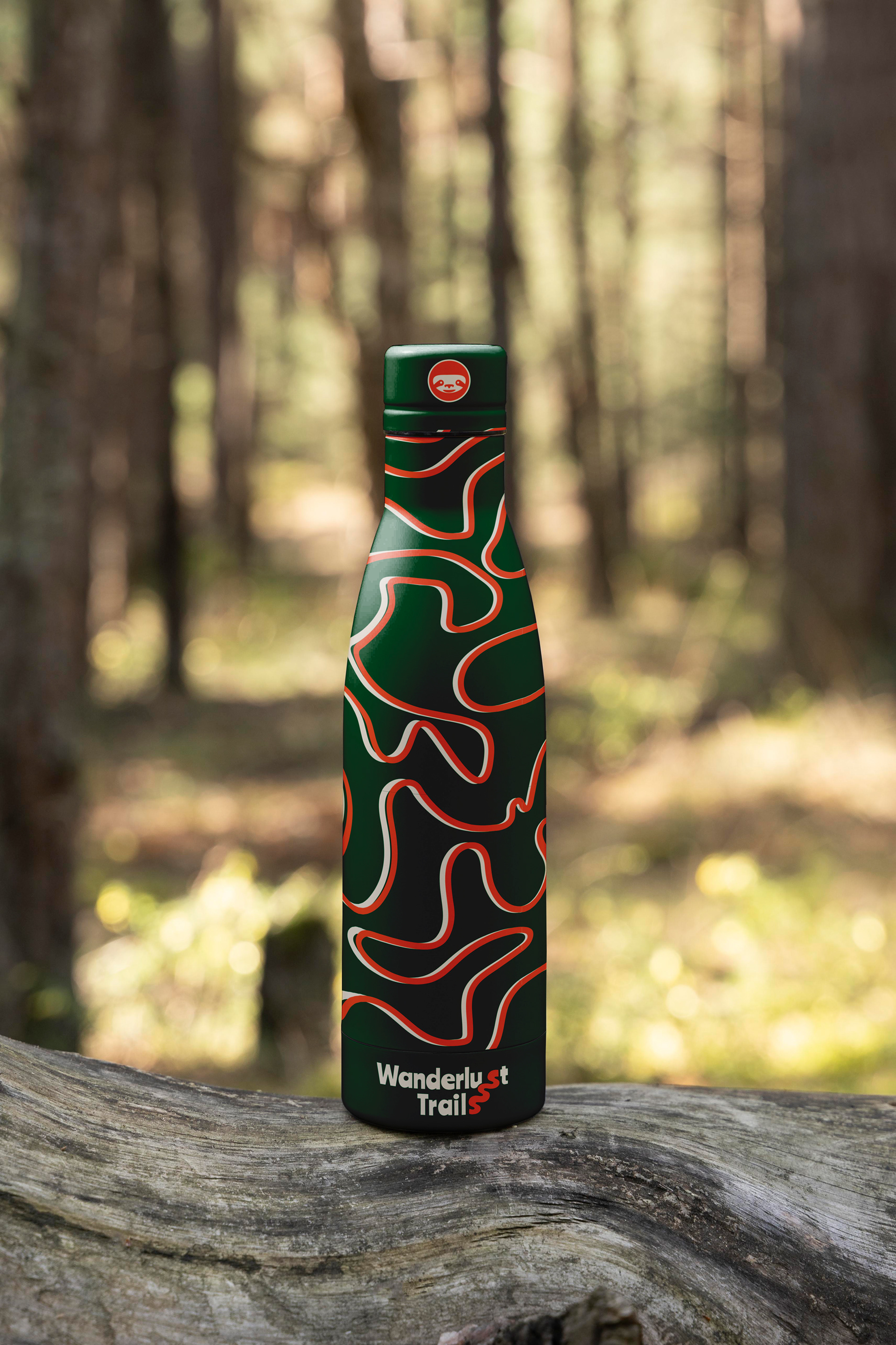


But Wanderlust Trails goes beyond a mere logo. The brand comes to life through a range of engaging assets. A dynamic pattern, inspired by a bendy trail, connects seamlessly with the "S" in the logo, reinforcing the company's commitment to exploration and discovery. Captivating icons depicting Costa Rican attractions, such as cascading waterfalls, majestic volcanoes, breathtaking beaches, and thrilling surf, further enhance the brand's visual identity.


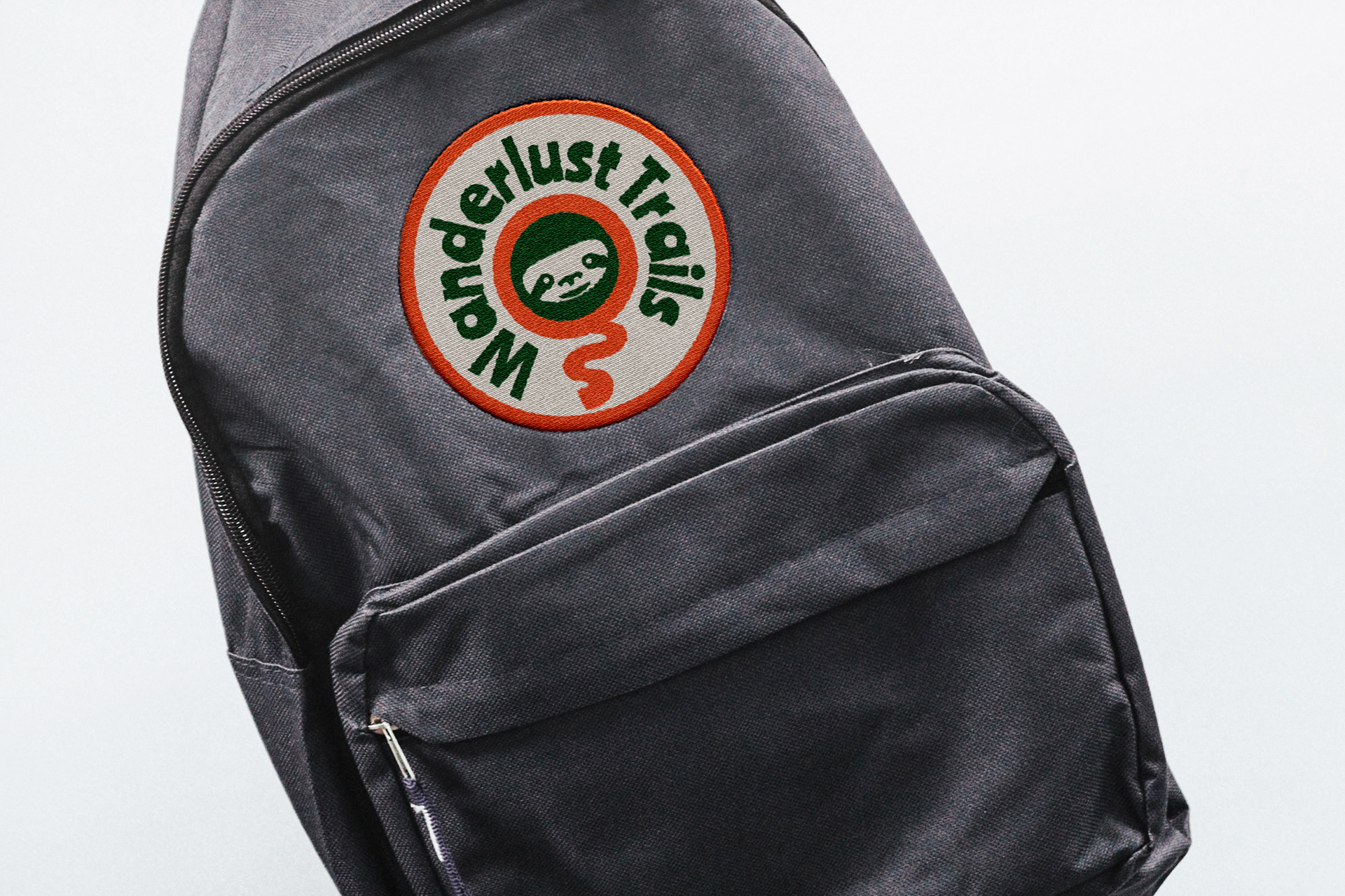
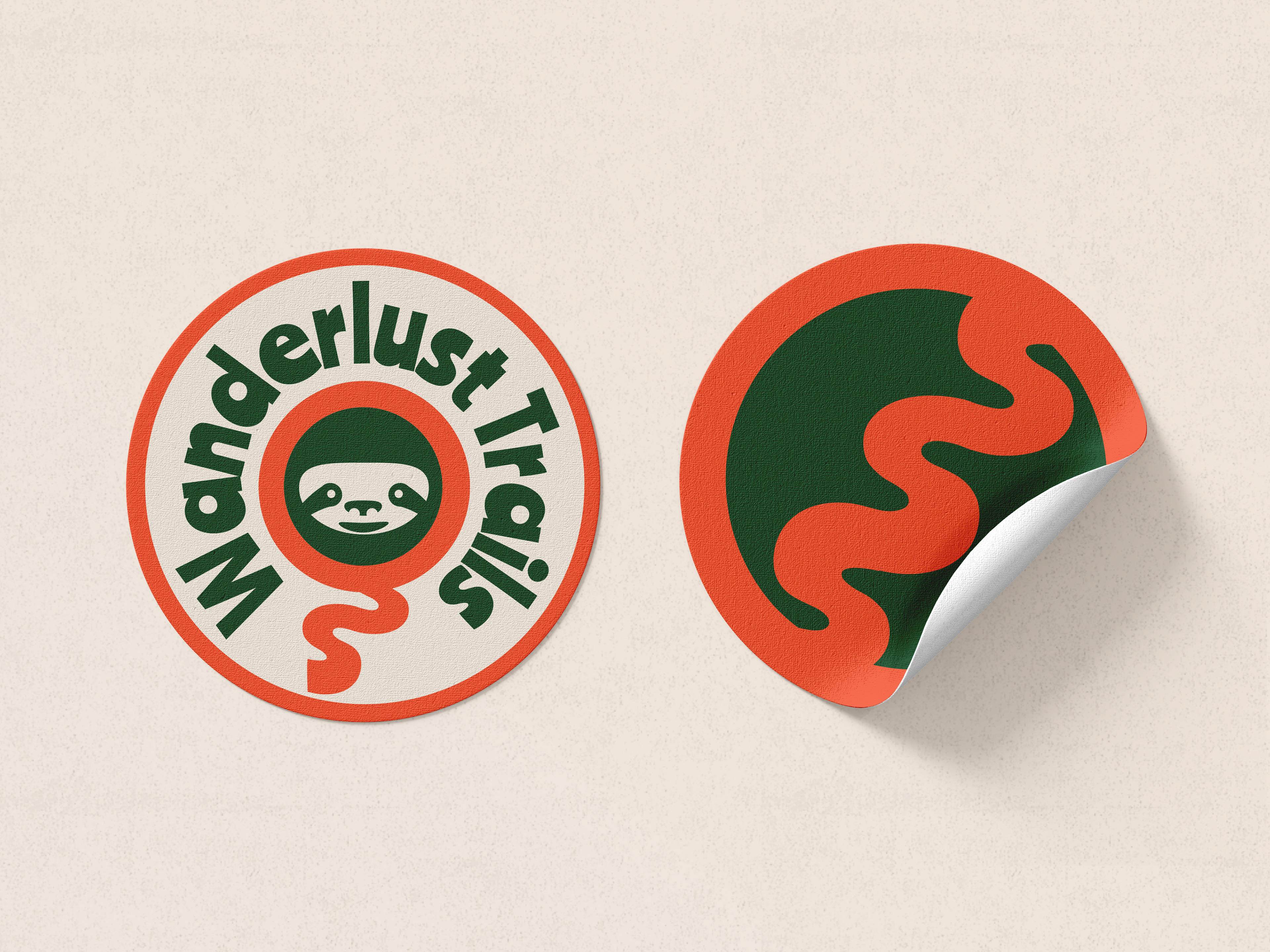
An alternative logo takes center stage, featuring a round design with a charming sloth at its core. Encircled by the text "Wanderlust Trails," this alternative emblem pays homage to one of Costa Rica's most beloved and iconic creatures. With its unique and endearing charm, the sloth logo provides a versatile option for various applications and reinforces the brand's playful nature.